iPhone Duo for React Native, Flutter and the web
What the fold looks like from React Native, Flutter, a web page and a WebView. What every stack gets for free, which bridges expose the hinge and the fold, and what still needs Xcode.
Apple’s sessions, and the rest of these guides, speak SwiftUI and UIKit. Most apps on the App Store are not written in either. If yours is React Native, Flutter, a web page, or a web page inside a native shell, the question is the same: how much of the Duo behaviour arrives on its own, and what needs a bridge.
The short answer is that the window comes for free and the fold does not. iOS owns the window, so every stack sees it resize and sees the safe areas change. The fold’s position, the hinge angle, the side column, and the arrangements are UIKit and SwiftUI APIs, and a framework that draws its own interface only gets them through native code. This page is what each stack has today, from the people who built the bridges.
In short
- Build with Xcode 27.1 whatever the stack. Linked against 27.0, the app gets a boxed window with horizontal bars and no fold information.
- Window size and safe-area insets reach every framework through UIKit. Read each inset separately: the side column makes them uneven.
- The fold, the hinge and the vertical bar edge need a bridge. React Native and Flutter each have community packages, all tested on the simulator and none on hardware yet.
- Bars you draw in JavaScript, Dart or HTML never move to the side. Only bars UIKit owns do.
- Safari cannot tell a page where the fold is. The page sees a resize.
What every stack gets, and what none of them do
An app linked against iOS 27 becomes resizable, and Apple’s engineers have said you cannot turn that off. Built with the 27.1 SDK, it also gets the whole display and the insets for the side column. That is all window-level behaviour, so it reaches any framework that reads the window: useWindowDimensions and the safe-area context in React Native, MediaQuery.sizeOf and MediaQuery.paddingOf in Flutter, the resize event in a browser. Flutter’s paddingOf reports left and right separately, which matters here, because closed in portrait the simulator reports 84 points on the trailing edge and nothing on the other side.
What no framework gets without native code:
- The reserved regions, the frames of the fold and the under-display camera.
- The hinge status and angle.
- Which edge the vertical bar took.
ArrangementViewand the camera accessory for the outer display.- Bars that move. The system moves navigation, toolbar and tab items only in containers UIKit owns. A tab bar drawn by a JavaScript or Dart component is just pixels to it, and stays at the bottom. If your navigation library wraps a real
UINavigationController, check what its header does on the Duo simulator before assuming either way.
| React Native | Flutter | Web page in Safari | Web page in a WKWebView | |
|---|---|---|---|---|
| Resizes between displays | Yes | Yes | Yes | Yes |
| Safe areas, per edge | Safe-area context | MediaQuery.paddingOf |
env(safe-area-inset-*) with viewport-fit=cover |
The same |
| Where the fold is | Bridge | Bridge | No | The native shell can post it in |
| Hinge status and angle | Bridge | Bridge | No | The native shell can post it in |
| Bars move to the side | Only UIKit-owned bars | No | No | No |
React Native
Two libraries cover the gap, and they divide the work the way Apple’s own APIs do: one reads the state, the other arranges views.
react-native-nitro-hinge, by Gautham Vijayan, is the state. Its useHinge() hook, and a synchronous hinge object for use inside StyleSheet.create(), give you a width and height class, the window size, safeInsets with each edge on its own, a foldFeatures array, a nullable hingeAngle, the font scale, and a deviceInfo record. The width classes are the library’s vocabulary, compact, medium and expanded, not UIKit’s two. Helpers answer the common questions: isCompactWidth(), hasActiveFold(), isBookPosture(), isTabletopPosture(), contentWidth(). The README verifies six Duo poses on the Xcode 27.1 simulator: the closed phone is compact with the bar on the right in portrait and the left in landscape, the open phone is medium upright and expanded sideways. It deliberately ships no isDuo() check. The library’s line is “ask the window, not the device”, which is Apple’s line too.
Requirements: React Native 0.75 or newer, Nitro Modules, and for fold detection iOS 27.1 with HINGE_IOS_27_1_SDK=1 set in the podspec, so it still compiles on an older SDK and falls back. Android gets the same shape from androidx.window. Expo is not supported yet; a config plugin is planned. The idea on the wall has the pose screenshots.
react-native-arrangement-view, by Thiago Brezinski, is the layout. <ArrangementView arrangement="split"> with ArrangementView.Primary and ArrangementView.Secondary children delegates to SwiftUI’s own ArrangementView on iOS 27.1, so the split moves to the fold the way the native one does. arrangement="overlay" floats the primary pane over the secondary. axes limits the split to one direction. Inside either pane, useHingeChange() returns { available, angle, status }, with the angle in radians and the status one of unknown, closed, partiallyOpen or fullyOpen. On Android it applies Jetpack WindowManager fold detection with a configurable hingeGap and hingePolicy. Below iOS 27.1, split mode shows only the primary pane. It adds no safe-area padding of its own, it needs a development build rather than Expo Go, and Thiago’s announcement calls version 0.1.0 not production ready, iPhone Duo first and Android next. The post shows it on the simulator.

Announcing react-native-arrangement-view 0.1.0 ✨ Easily adapt your React Native app to foldables, arrange views between screens, and fetch hinge state Not prod ready yet, first on iPhone Duo , Android coming next release 🔜 Contributions welcome!… Show more
Expo. Krystof Woldrich posted that iPhone Duo is coming to EAS Simulators, Expo’s remote iOS simulators, and to expo-device-hub and serve-sim for local streaming; Expo’s own account added that coding agents will be able to test the Duo without Xcode or a Mac. EAS Simulator is in a limited-access preview as of September, driven from the CLI, a REST API, a browser preview or an agent. Until the Duo appears there, the path is a development build on a Mac with Xcode 27.1, the same as any native app.
Flutter
Flutter resizes and reports safe areas correctly, because both come from the window. What it does not report is the fold. MediaQuery.displayFeatures, the API that carries hinges on Android foldables, is an empty list on iPhone Duo. A proposal in the Flutter repository, filed the day Duo was announced, would populate it from the iOS 27.1 reserved-region APIs: the .division region as a fold feature with bounds and a flat or half-opened posture, the under-display camera as a cutout. It is open, labelled P2, with a related pull request, and nothing has shipped at the time of writing. Until it does, TwoPane and every other widget that reads displayFeatures sees no hinge.
Two more things follow from Flutter drawing its own pixels. Nothing you build with AppBar, BottomNavigationBar or NavigationBar moves to the side column, so if you want a vertical bar on the closed phone you draw it. And SystemChrome.setPreferredOrientations behaves the way Apple describes: the lock holds on the outer display, and the inner display still turns.
Four packages fill the gap, all tested on the simulator only:
| Package | What it gives Flutter | Notes |
|---|---|---|
foldable, from medialyra.com |
hingeAngleStream and hingeStatusStream, reserved regions, size classes, a FoldAwareBuilder and DuoMediaQuery helpers |
iOS only. Resolves the APIs at runtime, so it compiles on older SDKs. Does not write displayFeatures unless you turn the bridge on |
dual_screen_hinge, from Code Growers |
Hinge angle and posture streams, reservedRegions on iOS 27.1, plus Android’s rear-display and dual-screen sessions |
Coalesces updates to about one per frame. Its README says to use displayFeatures for basic layout and this for continuous angles |
iphone_duo_ui_pro, from szymdzie |
A DuoEnvironment with size classes, regions, hinge and the vertical bar edge, and widgets built on it: FoldAwareTwoPane, FoldAlignedGrid, a DuoAdaptiveScaffold that draws a vertical bar, and DuoDisplayFeatures, which republishes the fold as a standard DisplayFeature |
Needs the UIScene lifecycle and a DUO_SDK_27_1 flag in the Podfile until every build machine has Xcode 27.1 |
nitro_fold_duo, from shreeman.dev |
Fold and camera geometry, hinge state and angle, the vertical bar edge and corner insets, over a Nitro FFI bridge rather than method channels | Version 0.0.1. Reports isSupported == false below iOS 27.1 |
Pick one, and keep the native rule: decide the layout from size and size class, and use the regions only to move a control off the crease. iphone_duo_ui_pro’s DuoDisplayFeatures is the pragmatic bridge if you already have displayFeatures-aware code from Android, because it makes that code work unchanged.
The web
Safari on iPhone Duo does not implement the two web standards for foldables. CSS Viewport Segments and the Device Posture API shipped in Chrome and Edge 138. WebKit has not adopted either, and its standards-position issues remain open. So a page cannot ask where the fold is or whether the phone is half open. What it gets is a viewport that changes size in the middle of a session, with no rotation, and a resize event when it does.
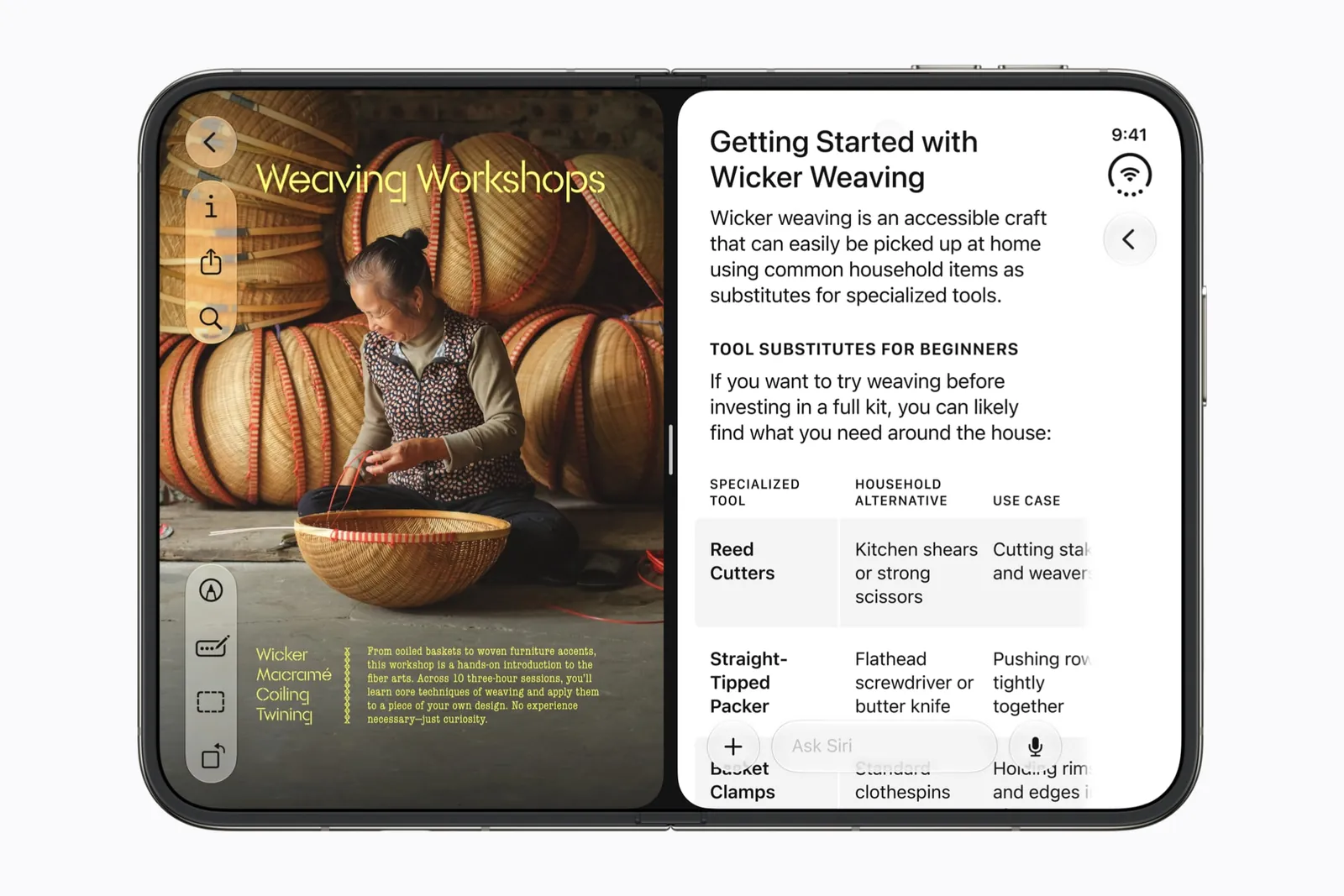
The closed viewport matches the outer display, about 466 × 678 CSS pixels at a device pixel ratio of 3. For the open phone, third-party device databases list about 890 × 626, and both Marker.io and Keishin Nishiura say that figure is an estimate nobody has confirmed from Apple. Measure it yourself: run Safari in the Duo simulator and read innerWidth in Web Inspector. Whatever the number, the open page is wide and nearly square, an aspect ratio around 1.4 against 2.2 on a normal iPhone, and the system’s side column takes one edge of it.
What to do about it, from Ingenious Techlab’s write-up and Nishiura’s:
- Lay out by container queries, not by window width, and audit breakpoints that assume a phone is tall.
- Use
100dvh, not100vh. - Add
viewport-fit=coverand readenv(safe-area-inset-left)andenv(safe-area-inset-right)separately. They differ. - Do not sniff the user agent. Duo reports itself as an iPhone.
- Keep a control someone must hit out of the centre band on a wide viewport, since you cannot know whether it is sitting on the crease.
- Test by dragging responsive design mode between the closed and open widths without reloading, which is what a fold does to your page.
A page inside a WKWebView, which is what a Capacitor app or an in-app browser is, sees exactly what Safari sees, plus whatever the native shell tells it. velhobit’s experiment on the simulator does that: SwiftUI reads the division region, whether it is active, its frame and its centre, and posts them into the page, which lays itself out around them. If your product is a web view in a native shell, that shell is where the fold lives.
Game engines and everything else
We found no Duo-specific guidance from Unity, Godot or JetBrains for Compose Multiplatform at the time of writing. All three render into one view, so they get the resize and nothing else. Treat a fold the way their Android guidance treats one, as a window-size change that can happen mid-frame, and keep the game playable at both sizes. Anything that needs the hinge angle is a native plugin, and the detectors in the hinge guide port to any language.
Test it like a native app
None of this spares you Xcode 27.1 and the iPhone Duo simulator. Whatever builds your app, the pass is the simulator checklist: every pose, a fold mid-task, both sides of Split View, each safe-area edge on its own. Two tools help from any stack. Artem Novichkov’s hinge command sets the simulator’s angle from a script, so a test run can fold the phone. And Riley Brown’s prompt for a coding agent, install Xcode 27.1 beta, set up the iPhone Duo simulator, build and launch the app, works the same for a React Native or Flutter project as for a Swift one.

Wow… you can now vibe code apps for the iPhone Duo with GPT-6 Sol and Opus 5.5! When building with Codex or Claude Code, simply ask: “Install Xcode 27.1 beta, set up the iPhone Duo simulator, then build and launch my app so I can see how it looks.”
The last step is the one no framework can skip. Every package on this page says the same thing in its README: tested on the simulator, not on a phone. Put the hardware pass on the calendar for October 23.
Keep reading
iPhone Duo app ideas: 6 things builders are doing with the fold
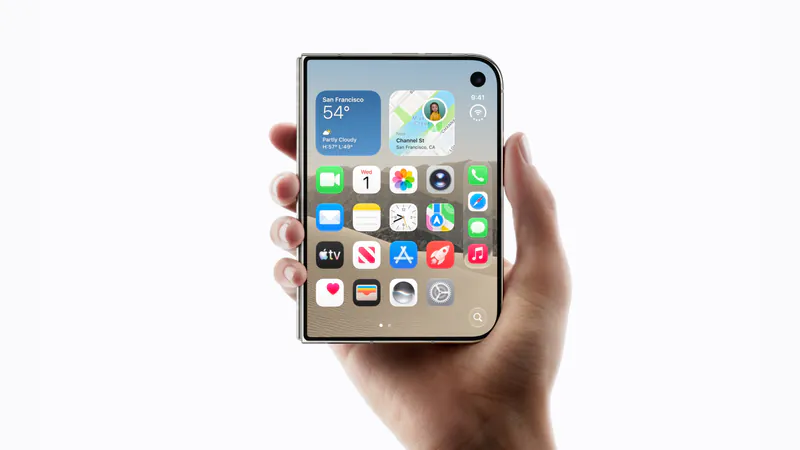
Over 300 demos, concepts and prototypes for iPhone Duo, sorted into the six patterns that keep coming up, from the half-folded laptop to the hinge as a controller. A starting point if you're deciding what to build.
Does iPhone Duo run iPad apps? The Duo and the iPad mini
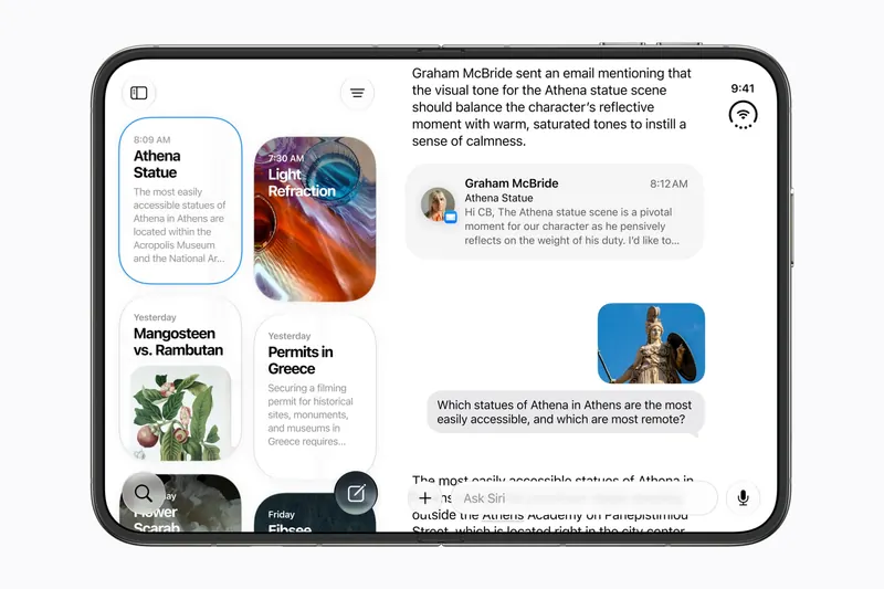
iPhone Duo's inner display is nearly iPad mini sized, but it runs iOS, not iPadOS. What that means for iPad-only apps, why many Duo apps will look like their iPad versions, and what the Duo borrows from iPad.
iPhone Duo games: what's coming, and what the fold does for play
Which games have been shown on iPhone Duo, how un-updated games look on the open display, and the new kinds of play builders are making with the hinge, the half fold and two screens.