The vertical bar on iPhone Duo
How iPhone Duo moves navigation, toolbars, and tabs to the side, which containers qualify, and how to place sheets and floating buttons.
On iPhone Duo the chrome moves. Navigation items, toolbar actions, and tabs can leave the top and bottom of the display and share one column on the side, which gives the content the height back. This happens when you build with the iOS 27.1 SDK. You keep declaring items in the same placements. SwiftUI and UIKit decide where they go.
This page is that decision, plus the cases where developers found the system will not help. For the overall layout, start with designing for iPhone Duo. For the crease itself, see the fold guide.
In short
- Rebuild with the iOS 27.1 SDK and keep bars in
NavigationStack,NavigationSplitView,TabViewor their UIKit controllers. Those move. A bar you built does not. - The side column appears on the outer display and on the open phone held sideways. Open and upright, the bars go back to the top and bottom.
- Symbol buttons turn on their own. Text and custom views stay horizontal unless you say
.axisBehavior(.verticalPreferred). - Turning the column off is a per-presentation choice. Make it once, for the whole screen.
- Sheets adapt by themselves and can be placed leading, trailing or centre. Floating buttons are the one piece you still place by hand.
Only bars the system owns will move
A toolbar on a NavigationStack, NavigationSplitView, or TabView is in. A UINavigationController or UITabBarController is in. A UIToolbar, UINavigationBar, or UITabBar you created and stuck in the hierarchy is out. Its items are never considered for the side column. Apple’s engineers said the same thing in the September group lab: a custom tab bar does not hop over by itself. You would be reimplementing the metrics.
The column is shared. Navigation, toolbar actions, and tabs occupy one strip, not three. It shows up where horizontal space is cheap and vertical space is not: the outer display, and the inner display in landscape. On the inner display in portrait, bars go back to the familiar top and bottom. People see that change every time they turn the open phone. Build for it instead of fighting it.
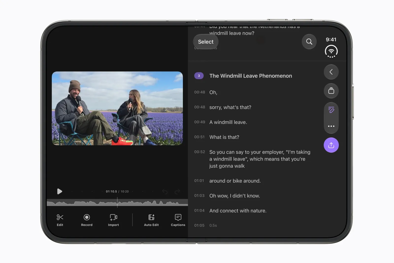
Sarun W., working from the Raise the Bar session, adds a constraint that is easy to miss in a split view. A bar moves when its container sits on the display edge. The detail column gets the vertical bar. The other columns keep a horizontal bar, and so does an expanded inspector, so it does not compete with the detail column. If a button “refuses” to move, check which column it lives in before you reach for an opt-out.
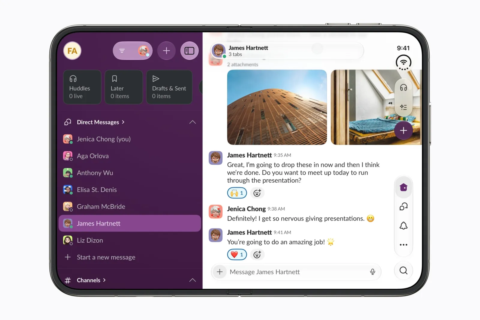
The column belongs to the hardware, not the reading direction. In a right-to-left language it stays on the same side of the device, and the content adapts around it. Inside it, keep Apple’s order from top to bottom: navigation such as Back or Close first, then a prominent action such as Done, then everything else in its original groups.
A horizontal bar has a fixed height and a flexible item width. A vertical bar swaps that. It has a fixed width and a flexible item height, so it wants symbols, not sentences.
Tell the system which items can turn
Standard symbol buttons can join the side column on their own. Text-only items, and custom views the system cannot resize, stay horizontal. A segmented control or a text button that is too wide stays in the horizontal bar even when everything around it has moved. If you already give a button both a title and an image, through a Label or the matching UIBarButtonItem properties, you are most of the way there. The system picks the form that fits.
When you want a different answer, set it.
.toolbar {
    ToolbarItem(placement: .bottomBar) {
        Compass()
    }
    .axisBehavior(.verticalPreferred)

    ToolbarItem {
        SelectOrDoneButton()
    }
    .axisBehavior(.horizontalOnly)
}
.verticalPreferred is how you opt a custom view in. .horizontalOnly keeps an item horizontal even when it has an icon, which is what you want for a control that swaps between a symbol and the word Done. Khoa Pham notes a third trick from the same session: a custom view that mixes an icon with a count can use badge() so the count becomes a badge and the icon can join the column.
Inside the custom view, read where you ended up.
struct Compass: View {
    @Environment(\.toolbarVerticalEdge) private var edge

    var body: some View {
        let layout = edge == nil ? AnyLayout(HStackLayout()) : AnyLayout(VStackLayout())
        layout {
            Image(systemName: "location.north")
            Text("N")
        }
    }
}
toolbarVerticalEdge is leading, trailing, or nil. Nil means the bars are horizontal right now, so draw the horizontal version. UIKit exposes the same fact as traitCollection.verticalBarEdge. If you set .horizontalOnly, keep the horizontal drawing even when the environment has an edge. The item is not in the column.
A few placements are worth knowing by name. cancellationAction stays at the top of the column. In UIKit that is a leading item group with leftItemsSupplementBackButton set to false, so your close button takes the back button’s place instead of sitting next to it. topBarPinnedTrailing, and UIKit’s pinned trailing group, keeps a primary action such as Share from falling into the overflow. visibilityPriority decides who survives as the column runs out of room. By default, items overflow from the bottom upward.
When the column runs out of room
Tabs and toolbar items share the strip, and there is often not enough of it. SwiftUI can push toolbar items into an overflow menu, or collapse the tabs into a single switcher. toolbarVerticalCompressionBehavior chooses which happens first.
On iOS the default favors the tab bar: toolbar items overflow, tabs stay visible. Ask for that explicitly with .prefersTabBar, or flip it with .prefersToolbarItems when the actions are the product and the tabs can collapse. Natalia Panferova’s toolbar post shows both on the same editor. To choose which individual items survive the squeeze, set visibilityPriority on them.
If you have your own overflow actions, fold them into the system menu with ToolbarOverflowMenu instead of drawing a second menu. UIKit’s version is additionalOverflowItems.
Turning the column off
.toolbarVerticalBehavior(.disabled) sends the bars back to the top and bottom and restores a horizontal status bar. UIKit’s equivalent is preferredVerticalBarBehavior returning .disabled.
Use it when the side column costs you width you actually need: a video player, a camera, a single close button on a sheet, a layout like Weng Tianxin’s photo frame in the design guide. Apple’s recommendation, repeated by Natalia, is to keep the vertical bars for most interfaces. People will learn the column from everyone else’s apps. A fixed bar makes yours feel like it missed the update.
If you do opt out, do it for the whole presentation and leave it. The preference resolves at the window, or at the nearest presentation such as a sheet. Within a window, SwiftUI takes it from the top view of a NavigationStack, the selected tab of a TabView, or the trailing column of a NavigationSplitView, so changing it as someone pushes a new screen makes the chrome flip in the middle of a task. Artem Novichkov saw the same thing in the simulator: the setting flows up to the window or the nearest presentation, which is why Artem’s sample presents that screen full screen.
Applied inside a sheet, the modifier affects the sheet only. The screen underneath can keep the default.
Sheets
Sheets pick up the same adaptations with no extra code, and then they add a placement.
On the outer display, a sheet’s controls go to the side. On the inner display, a centered sheet keeps a horizontal toolbar. As the phone folds partway, the system slides the sheet off the crease. You do not have to watch the hinge to get that.
presentationPlacement, from iOS 27, takes automatic, center, leading, or trailing. A gallery can open a sheet on the same side as the thumbnail the person tapped. Placement also changes the toolbar. Apple’s documentation on preparing your app says that on the inner display, centered and leading sheets use a horizontal toolbar, and a trailing sheet uses a vertical one.
In the iOS 27.1 beta, Natalia saw trailing sheets miss that vertical toolbar in both the flat and the partly folded poses. The close button could sit under the status display and the camera. One line cleared it in Natalia’s testing:
.sheet(item: $selection) { item in
    DetailSheet(item: item)
        .presentationPlacement(.trailing)
        .presentationDetents([.large])
}
Natalia is explicit that the detent is a workaround for this beta, not a requirement of placement. Check a trailing sheet in your own build before you copy it in, and again when the SDK updates. The checklist includes that pass.
Rob Swift hit the other sheet failure: a custom height that does not sit in the safe area. If you are setting a height by hand, look at it open, closed, and partly folded before you ship the number.
Floating buttons are yours to place
This is the gap everyone adapting a real app runs into. Harshil’s open layout behaved like an iPad. The closed layout was mostly a matter of the new horizontal insets. The control left over was a floating share button, and the open question was how much padding it needs to line up with the toolbars.
The only tricky thing left is how to handle floating UI like this share button It's tricky to figure out some heuristics for how much padding those need to have to align with toolbars
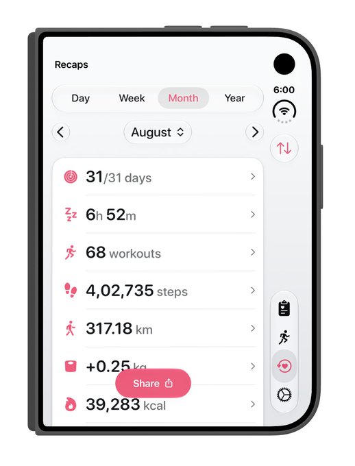
 Harshil@harshil2¢ on updating UI for iPhone Duo so far:
It's been surprisingly easy??
The opened UI is basically an iPad so no issues there. The closed one was a bit tricky because horizontal safe area and layout margins are a thing now, but still, it was fairly straightforward
Harshil@harshil2¢ on updating UI for iPhone Duo so far:
It's been surprisingly easy??
The opened UI is basically an iPad so no issues there. The closed one was a bit tricky because horizontal safe area and layout margins are a thing now, but still, it was fairly straightforwardRob Swift’s screens show the same family of bugs. Two trailing bar items laid out oddly. A bell drawn as a custom view pushed the button that was supposed to be at the top down beneath it. A floating action button sat high, because the bottom safe area is tall even when the toolbar has left the bottom edge. Matthaus Woolard, replying to Harshil, would put that share button in safeAreaBar(edge: .bottom) so the scroll view insets itself, the bar blurs locally, and the padding comes from the system. Matthaus also expects Apple would rather you move Share into the side column when there is room.

I use size classes and I'm still finding the Duo to be completely different animal than iPhone or iPad. Here you see 2 right bar button items laying out very oddly on the Duo.
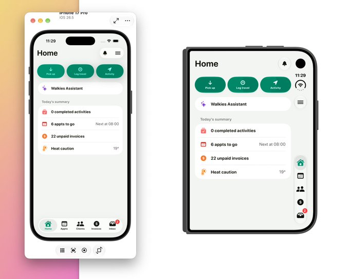
If the bottom inset is still reserving space for a toolbar that is no longer at the bottom, treat it as a bug and file it, which is what Matthaus suggested on that thread. Then decide whether the button should be a toolbar item. A plus button that adds to a list belongs with that list, as a toolbar action, more often than it belongs in a circle positioned in a ZStack.
Sahil AK’s TimeWave adaptation is the short version. The native toolbar APIs did the work, and the floating plus was what remained. The post is in the design guide.
Quick reference
| You want to | SwiftUI | UIKit |
|---|---|---|
| Let a custom item join the column | .axisBehavior(.verticalPreferred) on the item |
|
| Keep an item horizontal even with an icon | .axisBehavior(.horizontalOnly) |
|
| Draw a custom view for the column | read @Environment(\.toolbarVerticalEdge) |
traitCollection.verticalBarEdge |
| Put a close button at the top of the column | .cancellationAction placement |
a leading group, leftItemsSupplementBackButton = false |
| Keep a primary action out of the overflow | .topBarPinnedTrailing |
navigationItem.pinnedTrailingGroup |
| Turn an icon-plus-count view into icon and badge | .badge() |
UIBarButtonItem.badge |
| Choose what collapses first, tabs or actions | .toolbarVerticalCompressionBehavior(.prefersTabBar) or .prefersToolbarItems |
|
| Choose which items survive the squeeze | .visibilityPriority() |
|
| Fold your own actions into the system overflow | ToolbarOverflowMenu |
additionalOverflowItems |
| Send the bars back to the top and bottom | .toolbarVerticalBehavior(.disabled) |
preferredVerticalBarBehavior returning .disabled |
| Place a sheet | .presentationPlacement(.leading / .center / .trailing) |
Blank UIKit cells are features the sources above only describe in SwiftUI. Check Apple’s UIKit documentation before you assume there is no equivalent.
Keep reading
iPhone Duo app ideas: 6 things builders are doing with the fold
Over 300 demos, concepts and prototypes for iPhone Duo, sorted into the six patterns that keep coming up, from the half-folded laptop to the hinge as a controller. A starting point if you're deciding what to build.
Does iPhone Duo run iPad apps? The Duo and the iPad mini
iPhone Duo's inner display is nearly iPad mini sized, but it runs iOS, not iPadOS. What that means for iPad-only apps, why many Duo apps will look like their iPad versions, and what the Duo borrows from iPad.
iPhone Duo games: what's coming, and what the fold does for play
Which games have been shown on iPhone Duo, how un-updated games look on the open display, and the new kinds of play builders are making with the hinge, the half fold and two screens.